At least once a month, I discover a new brand and take a quick peek at their profile. Within a few seconds, I decide if I’ll hit that “follow” button or exit the page.
In those few seconds that I’m assessing the brand’s profile, I’m asking myself two questions: Is their content visually appealing and am I interested in the type of content they will be posting?
I’d bet many social media users take a similar approach. This is why social media design is an instrumental part of your social strategy. So much of social media is about perception and design plays a big role in determining that.
How can you make sure your design attracts the right audience? We’ll cover that and more below.
Nowadays, social platforms are often the first place consumers discover brands. As such, making a great first impression is the first step to building a robust social media presence.
Your social media design will also impact your brand perception. Every post you create and publish tells a story and contributes to your brand image. You want to make sure that story aligns with your overall messaging and builds a connection with your audience.
This is particularly important on platforms that prioritize visuals, like Instagram, TikTok, and Facebook. But you’ll still need to make sure your designs are consistent on all platforms.
What to Consider For Social Media Post Designs
Before you start working on your design, you’ll want to consider a few things. The first is your brand identity – your social media platform will be the visual representation of it, so you and your team must have a clear idea of what it is.
The next step is conducting market research to understand your audience. Questions to answer include:
- What are they looking for in a brand?
- What are their values?
- What are they interested in?
- What are they concerned about?
- What do they like to see on social media? What do they like to see on X platform?
This will serve as your frame of reference to drive your design approach.
You’ll then want to look at your competition’s designs. While you have your unique approach, it’s useful to know what visual strategies they’re using and how consumers are responding. The more information you have, the better equipped you will be to design creative assets that resonate with your audience.
Tips For Designing Social Media Posts
1. Aim for consistency and cohesion.
Consistency is key when designing your social media page. Why? Because it helps with brand recognition.
Imagine if every time you saw a brand, they changed their brand colors and logo. You would probably confuse it for another brand or forget it altogether. Brand recognition is important for building trust and loyalty with your audience.
Beyond posting regularly, consistency on social media also means sticking to a visual theme. Is it dark and moody or light and airy? Do you want your page to evoke calm, excitement, balance, focus, or something else?
Whatever your answers are to those questions should be reflected in a cohesive design. One way to do this is by using the same filter or editing style on all of your images to ensure they all fit within your branding.
2. Use colors to mirror your brand identity.
It’s no surprise that colors affect how consumers perceive your brand. That’s why popular food brands are usually associated with the colors red and yellow, and financial institutions with blues.
There are a few ways to incorporate color into your social media design. The first is in your templates. If you plan to use templates when posting graphics, you’ll want to incorporate your colors to increase your brand recognition.
For your images and videos, you can also highlight certain colors to stand out.
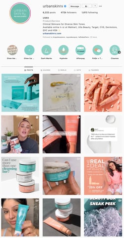
In the example above, Urban Skin consistently uses two main colors in its design: peach and turquoise. While they may have other colors in their images, these two are always front and center.
Another strategy is designing your social media posts to align with a particular theme and color. For instance, let’s say you’re a fashion brand and you’re planning February content. Given the association of February with Valentine’s Day and the color red, you could build your creative assets around that theme for the month.
3. Use social media design templates.
If you want to scale your social media strategy, you’ll likely need to have templates.
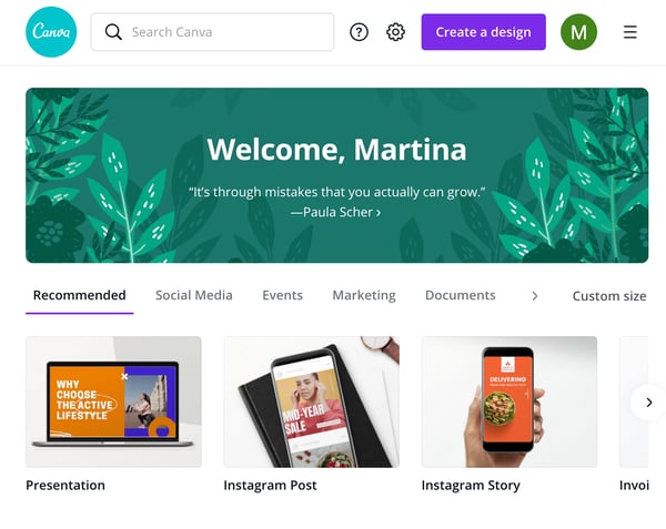
They’re a huge time saver and ensure consistent branding. Platforms like Canva make it easy for teams to create and share templates that have been approved by the branding team and align with your strategy. Jump to that section [here].
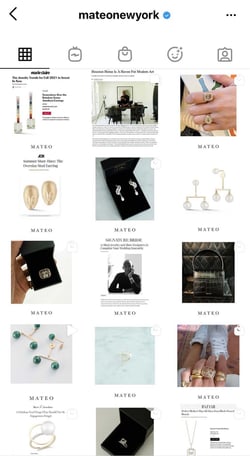
Be sure to have a diverse set of templates that can be used for various content types, such as infographics and videos. For instance, this brand Mateo New York likely uses templates that produce a sleek and attractive layout that stays consistent.
4. Adapt your design to the platform.
Every platform has different sizing and content guidelines.
For example, Instagram Reels are formatted to be viewed on smartphones, which means videos must be filmed in portrait orientation. Facebook, on the other hand, is formatted for landscape videos – similar to YouTube.
For videos in particular, you want to avoid having content with black sidebars, as that isn’t visually appealing.
Beyond sizing, you also have to consider which platforms are appropriate for certain designs. For instance, an infographic probably wouldn’t do well on Twitter. Breaking that content down into a text thread is a better strategy.
Following these guidelines will make your content more likely to perform well.
5. Follow design best practices.
The main goal of your social media design is to create visually appealing content that captures your audience’s attention and encourages them to engage.
While several factors influence this, there are general design rules that are known to create appealing visuals. The first is white or negative space, which is when an area in your frame is left empty. Using white or negative space helps draw the eye to what you want your audience to focus on.
Yvonne Koné uses white space in its social media design, which reflects the brand’s simplistic and minimalist identity.
Here are a few other design principles you’ll want to consider when developing your creative assets:
- Hierarchy – Arranging your visual elements by order of importance. You can do this by playing around with sizing, contrast, space, and other elements.
- Balance – Having equal visual weight in an image, which creates harmony, like in this example.
- Contrast – Putting elements with opposite colors, sizes, or textures to make them stand out.
6. Don’t forget about your profile.
While the main focus will be on your social media posts, don’t forget to design your social profiles.
Your profile picture, cover photo, and other visual elements should be a top priority when designing your social media. Here are some tips to follow:
- Be sure to use the same profile picture, i.e. your logo, on all social platforms.
- Use a cover photo that aligns both visually and contextually with your brand.
- Only update your profile to highlight events or holidays that are important to your brand. For instance, some brands add a rainbow pride flag to their logo in June in solidarity with the LGBTQ community.
7. Rely on creative professionals.
Your social media design will only be as good as your investment.
When it comes to images and illustrations, it’s worth consulting professionals who specialize in creating high-quality content. They can guide you through the creative process and make suggestions that will elevate your design.
If your team cannot invest in a full-time creative, consider independent contractors. With this approach, you can work on a project-by-project basis and experiment with different designers.
How To Find Social Media Design Templates
If your team wants an easy way to source templates, there’s a cost-effective way to do so without sacrificing quality. Many online branding companies offer customizable templates that have been designed by professionals. Here are a few to consider:
1. Canva
Canva is a graphic design platform with over 250,000 free templates available for personal and commercial use.
In addition to templates, Canva also has an extensive stock library with photos, animations, and videos for brands in any industry. The platform is free for individual users and has professional and enterprise options for larger companies, with pricing going up to $30/month.
2. Lucidpress
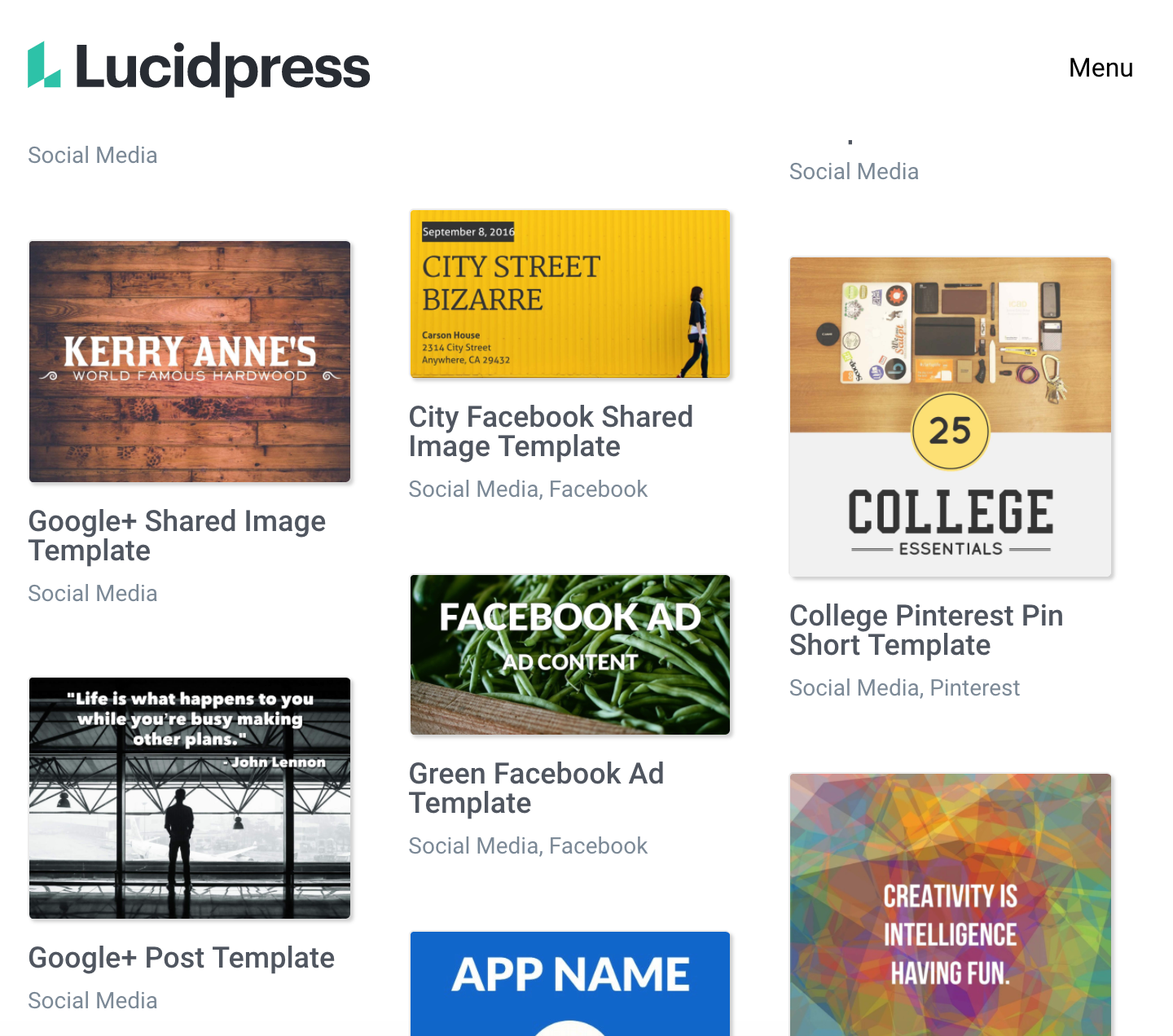
Lucidpress is a brand templating platform that makes it easy to create everything from social media posts to ebooks.
The platform is free to start using. To gain access to unlimited templates, pricing starts at $10 a month and can go up depending on your business needs.
Your branding doesn’t stop at your logo or website. It also extends to your social media. By investing time to develop a brand-specific social media design, you will get one step closer to connecting with your target audience.
from Irvine Business Signs https://ift.tt/3fCnytk
via Irvine Sign Company


